


Mobile Navigation UX: Why Ella Theme’s Menu Reduces Bounce Rates

In 2026, the battle for e-commerce dominance isn't fought on a 27-inch monitor; it’s fought on a 6-inch screen. With over 80% of Shopify traffic now originating from mobile devices, your store's navigation is no longer just a menu—it is the digital steering wheel of your business.
If a visitor cannot find what they are looking for within three seconds of landing on your mobile site, they don't just leave—they "bounce" back to Google, signaling to search engines that your site is irrelevant. This leads to a higher Bounce Rate, defined mathematically as:
$$Bounce\ Rate = \frac{Total\ Number\ of\ One-Page\ Visits}{Total\ Number\ of\ Entrances} \times 100\%$$
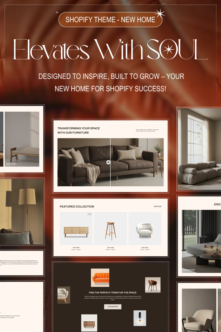
At Halothemes, we’ve engineered the Ella Multipurpose Shopify Theme with a "Mobile-First DNA" specifically designed to keep that percentage as low as possible. Here is why Ella’s mobile navigation is the gold standard for 2026.
1. Mastering the "Thumb Zone"
The biggest mistake in mobile UX is placing critical navigation elements at the top corners of the screen—the hardest areas for a human thumb to reach. According to UX Research by the Nielsen Norman Group, 75% of users navigate mobile screens using only one thumb.
The Ella Fix: Our themes utilize a "Bottom-Sticky Navigation" or "Thumb-Friendly Mega Menus." By placing the most important links (Cart, Search, Wishlist, Menu) within the natural arc of the thumb, we reduce the "interaction cost," making it effortless for customers to browse deeper into your catalog.

2. Visual Mega Menus: Moving Beyond Text
In 2026, customers don't want to read a list of 50 text links. They want to see where they are going. A text-heavy mobile menu increases cognitive load, leading to "Decision Fatigue," which we discussed in our Conversion Killers Guide.
The Ella Advantage: Ella 7 features Visual Mobile Mega Menus. This allows you to integrate:
-
Product Thumbnails: Show the actual category (e.g., a photo of a dress next to the "Dresses" link).
-
Promotion Banners: Highlight a "Flash Sale" directly inside the menu.
-
Iconography: Small, intuitive icons that help users scan the menu 2x faster.
3. Zero-Lag Performance & Core Web Vitals
Navigation menus are often the "heaviest" part of a theme's mobile code. If your menu "jitters" or takes a second to slide out, Google’s Core Web Vitals (specifically Interaction to Next Paint - INP) will penalize your rankings.
By using native Liquid code and minimal JavaScript, the mobile menu in Ella and Spark triggers instantly. This snappiness creates a "Luxury Feel" that builds trust and keeps the user engaged.

4. Intelligent Search Integration
For high-inventory stores, the search bar is the most important navigation tool. In 2026, search must be Predictive and Persistent.
Ella’s mobile navigation includes a "Quick Search" feature that remains accessible even as the user scrolls. As they type, product results appear with images in real-time. This "Search-First" approach is a proven way to reduce bounce rates by getting users to their desired product in fewer than two clicks.
5. Mobile-Specific Breadcrumbs
When a user lands on a deep product page via a Long-tail Keyword Search, they need to know where they are. Mobile breadcrumbs in Ella are designed to be compact but clickable, allowing users to easily "jump back" to a parent category without hitting the back button.

CONCLUSION: NAVIGATION IS THE NEW CURRENCY
If your mobile navigation is a hurdle, your traffic will never convert. By prioritizing the "Thumb Zone," visual scanning, and lightning-fast performance, Ella Theme transforms your mobile store from a static page into a high-speed shopping experience.
Don't let a clunky menu kill your ROI. Upgrade to a theme that was born on mobile.