Two Lips: Creating a Website with Ella Shopify Theme that Matches Their Brand

Meet Two Lips
Two Lips is a luxury intimate skin care brand that offers products that are gentle, effective, and nourishing for your delicate areas. They have products that can treat, moisturize, nourish, and protect your intimate skin areas, such as your vulva, nipples, underarms, and more. They use natural ingredients and botanical extracts that are safe and beneficial for your skin. They also have products that are microbiome-friendly, meaning they support the natural balance of bacteria on your skin. They are also vegan, cruelty-free, paraben-free, sulfate-free, and fragrance-free.
Click here to start selling online now with Shopify
Solution
But did you know that they used a template called Ella Shopify Theme to create their stunning website? In this blog post, we will introduce and analyze how Two Lips used Ella Shopify Theme to create a visually appealing, user-friendly, and persuasive online shopping experience.
- The homepage of Two Lips is the first impression that visitors get when they land on their website. It is designed to showcase their brand identity, product categories, featured products, blog posts, and customer reviews.
- A header that contains their logo, menu, search bar, account, wishlist, and cart icons. The header is fixed at the top of the page, so it is always accessible to the visitors. The header also has a subtle animation effect when scrolling down the page, which adds some dynamism and elegance to the design.
- A banner slider that displays high-quality images of their products and promotions, with catchy headlines and call-to-action buttons. The banner slider has a smooth transition effect and a navigation dot indicator at the bottom. The banner slider is responsive and adapts to different screen sizes and devices.

The product page of Two Lips is where visitors can see more details about a specific product and add it to their cart. It is designed to provide all the necessary information and features to persuade visitors to buy the product. The product page has the following elements:
- A product image gallery that shows multiple images of the product from different angles or variants. The product image gallery has a thumbnail slider that shows the other images of the product and allows visitors to switch between them.
- A product title that shows the name of the product in a large and bold font.
- A product rating that shows the average rating of the product based on customer reviews. The product rating also shows the number of reviews.
- A product quantity selector that allows visitors to choose how many units of the product they want to buy. The product quantity selector has a plus and minus button that increases or decreases the quantity by one.

Which sections from the Ella Theme is Two Lips using on their homepage?
Two Lips is using version Ella Theme 6.5.0
- Header: Nav Utility
- Section: Slide Show
- Section: Product Block
- Section: Custom Image Banner Block
- Section: Product Block
- Section: Customer Review Block
- Section: Block Template
- Section: Brand Slider
- Section: Space Section
- Section: Custom Text Block
- Footer: 01
What are the differences in the homepage layout between a store with a small number of products and a store with a large number of products?
Design and Visual Elements:
- Store with Few Products: In a store with a small number of products, the design can be more visually focused, allowing for larger images, prominent product showcases, and ample whitespace. This can create a cleaner and more aesthetically pleasing layout.
- Store with Many Products: Stores with a large number of products may have a more structured and grid-based design. Smaller product thumbnails and concise information can help accommodate the extensive product range without overwhelming visitors.
Navigation:
- Store with Few Products: Navigation can be straightforward, and it's often feasible to display most or all products directly on the homepage or through simple navigation menus.
- Store with Many Products: Stores with a large inventory typically require more advanced navigation features, such as category filters, search bars, and layered navigation to help users find products efficiently.
Content and Promotion:
- Store with Few Products: Stores with fewer products can afford to emphasize each product individually. You can showcase bestsellers, promotions, or new arrivals prominently on the homepage.
- Store with Many Products: In stores with an extensive product range, you might prioritize content like featured categories, special collections, or product highlights to guide visitors to relevant sections.
What homepage template layout elements are recommended for a luxury intimate skin care brand with a limited product range?
1. Hero Banner:- A high-quality image or video showcasing the brand's flagship product or a model representing your target audience.
- A compelling tagline that communicates the brand's essence, e.g., "Elevate Your Intimate Care Experience."
- A prominent call-to-action (CTA) button, such as "Shop Now" or "Discover Our Collection."
2. Product Highlights:
- Display the featured product with a brief description and a "Shop Now" button.
- Include concise product information, emphasizing the unique selling points.
3. Brand Story:
- Share the brand's mission, values, and the story behind its creation.
- Highlight the focus on quality, natural ingredients, and the benefits of your products for customers.
4. Customer Testimonials:
- Showcase reviews, testimonials, or before-and-after photos from satisfied customers.
5. Product Categories:
- If you have multiple products, categorize them. For a small inventory, a single product category may suffice.
- Use high-quality images and brief descriptions for each product.
6. Blog or Education Section:
- Share informative content related to intimate skincare, such as skincare tips, ingredient highlights, or wellness articles.
7. Newsletter Signup:
- Encourage visitors to subscribe to your newsletter for exclusive offers and updates.
8. Social Media Integration:
- Display social media links or a live feed to keep visitors engaged with your brand.
9. Contact Information:
- Provide clear contact details for customer inquiries and support.
10. Footer:
- Include essential links, such as a privacy policy, terms and conditions, and shipping information.
11. Elegant Design Elements:
- Use a color scheme that reflects luxury, such as soft neutrals and gold accents.
- High-quality, professional product images and typography that complements the brand's aesthetic.
- Consider using parallax scrolling, subtle animations, or hover effects to add a touch of sophistication.
12. Trust Signals:
- Display trust badges, certifications, or partnerships that reinforce the brand's credibility.
13. Seamless Navigation:
- Ensure that the site's navigation is intuitive and user-friendly, allowing visitors to easily find products and information.
14. Mobile Responsiveness:
- Optimize the layout for mobile devices, as many users shop on smartphones.
- Remember that a luxury brand's website should exude elegance and exclusivity. A minimalist approach, premium visuals, and a focus on user experience are key to creating an engaging and effective homepage for your intimate skincare brand.
Result
In conclusion, Ella Shopify Theme is a multipurpose template that can help you create a stunning website for your luxury intimate skin care brand. It has many features and benefits that can make your website fast, responsive, accessible, elegant, and persuasive. It also has many customization options that can help you tailor your website to your brand identity, product catalog, and customer preferences. It also has many resources and support that can help you install and use the theme easily and effectively.
– Website: https://www.twolips.vip/
– Industry: Luxury Intimate Skin Care
– Theme: Ella
– Platform: Shopify
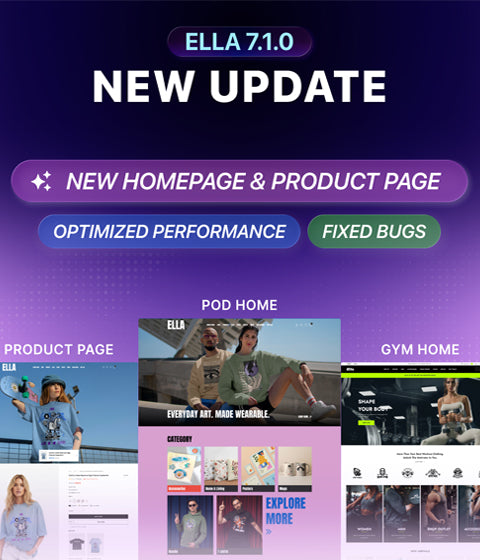
Ella - A Premium Shopify Theme Is Designed To Make Your Online Store Stand Out
An All-in-one theme with multiple layouts satisfies any specific requirements for different businesses. Boost your conversion with modern design and mobile optimized
Learn More


