


Best Shopify Theme for Mobile: Why 80% of Your Sales Depend on This

Let’s start with a brutal truth: When you are editing your Shopify store on a spacious 24-inch monitor, sipping coffee and admiring your beautiful layout... you are looking at a version of your store that only 20% of your customers will ever see.
The other 80%? They are on a bus, lying in bed, or walking down the street. They are holding a 6-inch screen.

According to Statista's 2026 Market Data, mobile commerce (m-commerce) now accounts for nearly 80% of all retail website visits.
If your website is simply a "shrunken down" version of your desktop site (Responsive), you are losing money every second. You don't just need a theme that adapts; you need a theme built with a Mobile-First Mindset.
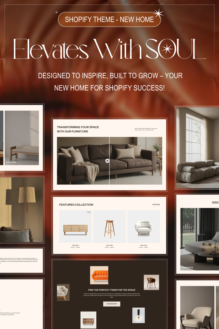
In this deep-dive guide, we analyze the science behind Mobile UX and why choosing the right theme—like Ella or Halo—is the most critical financial decision you will make this year.
Part 1: The Dangerous Confusion Between "Responsive" and "Mobile-First"
Many merchants think, "My theme is responsive, so I'm safe." No, you are not. Let’s distinguish the difference:
1. Responsive Design (The Old Way)
This follows a Desktop → Mobile workflow. Designers build the desktop site first, then use CSS to "squish," hide, or stack elements until they fit on a phone screen.
-
The Consequence: Buttons become too small, menus are hidden in hard-to-reach corners, and text requires zooming. This creates Cognitive Friction for the user.

2. Mobile-First Design (The 2026 Standard)
This follows a Mobile → Desktop workflow. Premium themes like Ella - Multipurpose Shopify Theme are engineered for the human thumb first. Every swipe, tap, and scroll is calculated for ergonomics. Only then is the design expanded for larger screens.
-
The Result: Your website functions smoothly, feeling less like a website and more like a high-end Native App (like Instagram or TikTok).
Part 2: The Science of "The Thumb Zone"
Why do customers bounce from mobile sites? Beyond slow speeds, the biggest reason is Physical Friction.

Researcher Steven Hoober’s study on mobile usage reveals:
-
49% of users hold their phone with one hand.
-
75% of all interactions are driven by the thumb.
This creates the concept of "The Thumb Zone":
-
Green Zone (Easy Reach): The bottom third of the screen.
-
Yellow Zone (Stretch): The middle third.
-
Red Zone (Pain/Hard): The top third (especially the corners).
The Failure of Legacy Themes:
Most free themes place the Menu (Hamburger Icon) in the top-left corner—the dead center of the Red Zone. To click it, users must adjust their grip or use a second hand. Every time they do this, it lowers their desire to shop.
The Solution (Ella & Halo):
We move all critical functions into the Green Zone, similar to our High Converting Layouts strategy:
-
Bottom Navigation Bar: Just like Facebook or Amazon. Customers can toggle between Home, Cart, and Account using only their thumb.
-
Sticky Add-to-Cart: The "Buy" button floats at the bottom of the screen. No matter where the customer scrolls, the conversion point is always under their thumb.
Part 3: Speed & Core Web Vitals (Mobile SEO)
On a desktop with fiber-optic Wi-Fi, a 2-second load time is negligible. On a phone using a spotty 4G connection, Google research shows that as page load time goes from 1s to 3s, the probability of bounce increases by 32%.
Google now strictly enforces Mobile-First Indexing. This means Google ranks your store based on the speed and content of your mobile site, not your desktop version.
A top-tier mobile theme must solve this technical challenge:
-
Smart Lazy Loading: The theme should not load every image at once. As the user scrolls, images load just in time. This boosts First Contentful Paint (FCP) scores.
-
Minimalist Code: Premium themes strip away heavy desktop effects (like video backgrounds) on mobile devices to ensure layout stability (CLS - Cumulative Layout Shift).
Ella Theme consistently scores 90+ on PageSpeed Insights for mobile due to its optimized Liquid code structure.
Part 4: The Best Mobile Themes Analyzed
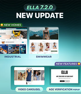
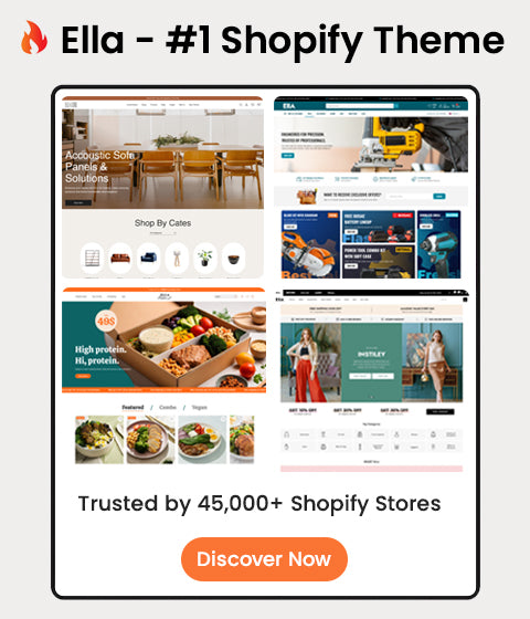
1. Ella - Multipurpose Shopify Theme (The App-Like Experience)
This is the "King of Mobile" in our Best Selling Collection.
-
Killer Feature: Mobile Toolbar & Off-Canvas Filters.
-
On standard themes, filtering products (by Size/Color) takes up too much screen real estate. Ella hides this in a smooth Off-Canvas Drawer that slides up from the bottom, making filtering effortless.
-
UX Design: The product page supports swipe gestures for images, combined with a sticky footer, creating a zero-interruption shopping flow.

2. Halo - Multipurpose Shopify Theme (Optimized for Visuals)
Perfect for Fashion, Beauty, and Lifestyle brands.
-
Killer Feature: Mobile Lookbook.
-
It utilizes Vertical Fullscreen imagery. Customers can tap on a bag or dress within a lifestyle photo to buy it instantly. This maximizes every pixel of the vertical phone screen.
-
Story Blocks: Halo Theme allows you to display circular "Story" elements at the top of the homepage, mimicking the familiar interface of Instagram to engage users immediately.
Part 5: The Mobile Audit Checklist
How do you know if your current theme is killing your sales? Pick up your phone and run these 4 tests:
-
The One-Hand Rule: Can you add a product to the cart and reach the checkout button using only one hand?
-
The Keyboard Test: When you tap the "Search" bar, does the virtual keyboard pop up and cover the search results? (Bad themes often fail this).
-
The Pop-up Test: Do your promotional pop-ups have an "X" (close) button that is too small? Google penalizes these Intrusive Interstitials.
-
The Font Check: Is your body text smaller than 14px? (If yes, your customers are squinting).
If you failed any of these, it is time to upgrade to a Mobile-First Theme.

Conclusion: Invest Where Your Customers Are
Stop designing websites for yourself (on desktop). Start designing for your customers (on mobile). The difference between an average store and a million-dollar brand often lies in the experience on a 6-inch screen.
Investing in a theme like Ella isn't just a cosmetic upgrade. It is a strategic move to optimize the revenue channel that provides 80% of your income.
👉 Experience the Ella Mobile Demo Here (Open this on your phone!)